
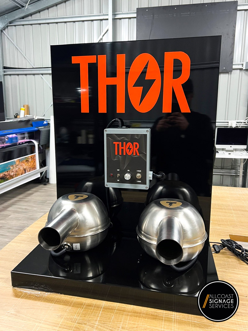
Red – Urgency, Energy, and Passion
Red is one of the most attention-grabbing colours. It creates a sense of urgency, making it ideal for sales, clearance signs, and fast-food branding. It stimulates appetite and excitement, which is why brands like McDonald’s and Coca-Cola use it prominently.
🔹 Best for: Retail sales, food industry, entertainment businesses
Blue – Trust, Stability, and Professionalism
Blue is associated with reliability, trust, and calmness. It is commonly used by financial institutions, healthcare providers, and corporate businesses to convey security and dependability. Darker shades of blue add a professional touch, while lighter blues create a fresh and welcoming feel.
🔹 Best for: Banks, law firms, medical clinics, technology brands
Yellow – Optimism, Warmth, and Attention-Grabbing
Yellow is an energetic colour that conveys happiness, positivity, and friendliness. It is effective for grabbing attention but should be used in moderation, as too much yellow can be overwhelming.
🔹 Best for: Hospitality, children’s brands, casual dining, call-to-action signage
Green – Growth, Health, and Sustainability
Green is strongly linked to nature, eco-friendliness, and well-being. Organic brands, health-focused businesses, and financial services widely use it. Green is also associated with wealth, making it a good choice for investment and finance brands.
🔹 Best for: Health and wellness, environmental businesses, financial services
Black & White – Elegance, Simplicity, and Luxury
Black signifies sophistication, exclusivity, and power, making it a popular choice for luxury brands. White, on the other hand, represents simplicity and cleanliness. Combining black and white creates a timeless, high-end aesthetic.
🔹 Best for: Luxury brands, high-end retail, corporate businesses
Orange – Excitement, Fun, and Creativity
Orange is an energetic and playful colour that evokes enthusiasm. It is commonly used by brands that want to appear approachable and youthful.
🔹 Best for: Sports brands, creative agencies, promotions
Choosing the Right Colour for Your Business Signage
When selecting colours for your signage, consider these factors:
✔ Industry and Brand Identity – Choose colours that align with your brand’s personality and industry standards. For example, healthcare brands often use blue and green, while retail stores might opt for red or yellow.
✔ Contrast and Readability – High-contrast colour combinations (e.g., black on yellow or white on blue) improve readability, making your signage more effective.
✔ Location and Surroundings – Consider the environment where your signage will be displayed. A bright yellow sign might stand out in an urban setting but could be too overpowering in a natural landscape.
✔ Cultural Influences – Colours have different meanings in different cultures. For example, red symbolises good luck in some cultures but can signify danger in others. If your business serves a multicultural audience, be mindful of these variations.
✔ Psychological Impact on Customers – Consider the emotions you want your signage to evoke. If you’re a luxury brand, black and gold may be the best choice. Green will reinforce your eco-friendly message if you run a health food store.
How to Integrate Colour Psychology into Your Signage Design
To maximise the effectiveness of your signage, follow these best practices:
🎯 Use Colour to Highlight Key Information – Calls to action, phone numbers, and important messages should be in bold, contrasting colours to ensure they stand out.
🎯 Stick to a Consistent Colour Scheme – Align your signage colours with your existing branding for a cohesive and professional look.
🎯 Test Different Combinations – Before finalising your design, test colour contrasts to ensure maximum visibility in different lighting conditions.
🎯 Consider Illuminated Signage – Backlit or LED signs enhance the impact of colours, making your signage visible day and night.
Final Thoughts: The Power of Colour in Signage
Colour is more than just an aesthetic choice—it’s a strategic branding tool influencing customer perceptions and decisions. The right colour scheme can attract attention, communicate your message effectively, and reinforce your brand identity.
At AllCoast Signage Services, we specialise in designing custom signage solutions that use colour psychology to enhance brand visibility and engagement. Whether you need a bold storefront sign, professional office signage, or eye-catching vehicle branding, our team can help you create signage that resonates with your audience.
Ready to enhance your signage with the perfect colours? Contact AllCoast Signage Services today to discuss your project. Let’s bring your brand to life with expertly designed signage.


